ShopDreamUp AI ArtDreamUp
Deviation Actions


Suggested Deviants


Suggested Collections


![[HM:SoS] Bachelors](https://images-wixmp-ed30a86b8c4ca887773594c2.wixmp.com/f/7418ef54-493b-49d0-9c0d-849bb80af8b0/d8nxs5u-97526eba-393d-47df-bce8-8b833875b0cf.png/v1/crop/w_184,h_184,x_84,y_0,scl_0.40888888888889/_hm_sos__bachelors_by_ohyafumi_d8nxs5u-92s-2x.png?token=eyJ0eXAiOiJKV1QiLCJhbGciOiJIUzI1NiJ9.eyJzdWIiOiJ1cm46YXBwOjdlMGQxODg5ODIyNjQzNzNhNWYwZDQxNWVhMGQyNmUwIiwiaXNzIjoidXJuOmFwcDo3ZTBkMTg4OTgyMjY0MzczYTVmMGQ0MTVlYTBkMjZlMCIsIm9iaiI6W1t7ImhlaWdodCI6Ijw9MzY0IiwicGF0aCI6IlwvZlwvNzQxOGVmNTQtNDkzYi00OWQwLTljMGQtODQ5YmI4MGFmOGIwXC9kOG54czV1LTk3NTI2ZWJhLTM5M2QtNDdkZi1iY2U4LThiODMzODc1YjBjZi5wbmciLCJ3aWR0aCI6Ijw9MTAyNCJ9XV0sImF1ZCI6WyJ1cm46c2VydmljZTppbWFnZS5vcGVyYXRpb25zIl19.PgXp2r9h9sc2xD2D9Bnupk2cj-hF-OcpVf5FiKo5NIY)
![[HM:SoS] Bachelors](https://images-wixmp-ed30a86b8c4ca887773594c2.wixmp.com/f/7418ef54-493b-49d0-9c0d-849bb80af8b0/d8nxs5u-97526eba-393d-47df-bce8-8b833875b0cf.png/v1/crop/w_92,h_92,x_42,y_0,scl_0.20444444444444/_hm_sos__bachelors_by_ohyafumi_d8nxs5u-92s.png?token=eyJ0eXAiOiJKV1QiLCJhbGciOiJIUzI1NiJ9.eyJzdWIiOiJ1cm46YXBwOjdlMGQxODg5ODIyNjQzNzNhNWYwZDQxNWVhMGQyNmUwIiwiaXNzIjoidXJuOmFwcDo3ZTBkMTg4OTgyMjY0MzczYTVmMGQ0MTVlYTBkMjZlMCIsIm9iaiI6W1t7ImhlaWdodCI6Ijw9MzY0IiwicGF0aCI6IlwvZlwvNzQxOGVmNTQtNDkzYi00OWQwLTljMGQtODQ5YmI4MGFmOGIwXC9kOG54czV1LTk3NTI2ZWJhLTM5M2QtNDdkZi1iY2U4LThiODMzODc1YjBjZi5wbmciLCJ3aWR0aCI6Ijw9MTAyNCJ9XV0sImF1ZCI6WyJ1cm46c2VydmljZTppbWFnZS5vcGVyYXRpb25zIl19.PgXp2r9h9sc2xD2D9Bnupk2cj-hF-OcpVf5FiKo5NIY)
You Might Like…


Featured in Groups

Description
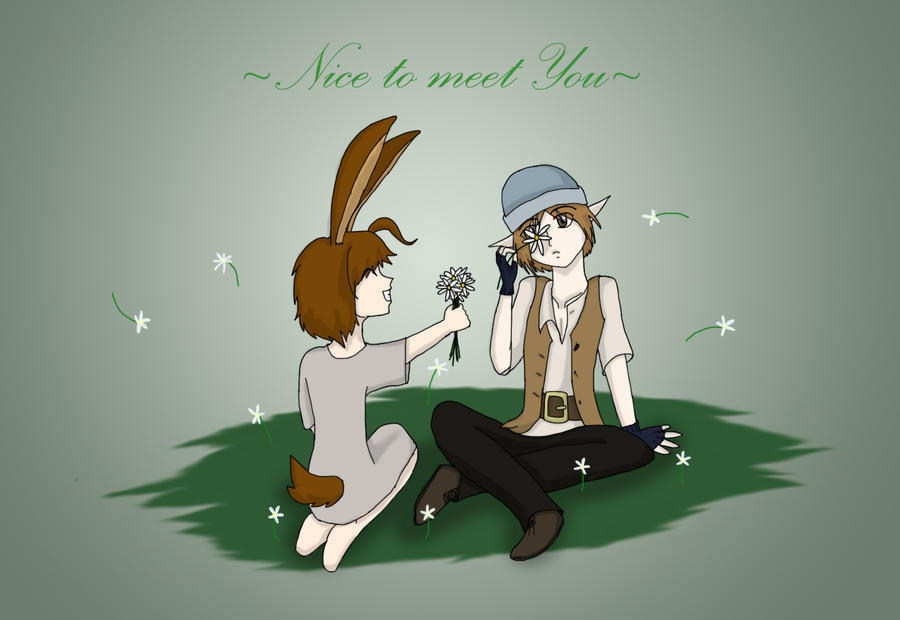
M'rin has done it again!! She had found ANOTHER guy to torment- er... love and have fun with, uhhh...  and be... nice to.....
Anyways, this is 's prize for the contest I'm doing. [link]
It's still open so anybody can do it!
Here's her entries: +
+ 
Anyway! This is M'rin with Hykian, an elf from my book I'm gonna start at some point Elven Charmer.
Hope you like it!
M'rin (c) *WolfPawDragonClaw
Hykian (c) *swordclaw42
Anyways, this is
's prize for the contest I'm doing. [link]It's still open so anybody can do it!
Here's her entries:
+ Anyway! This is M'rin with Hykian, an elf from my book I'm gonna start at some point Elven Charmer.
Hope you like it!
M'rin (c) *WolfPawDragonClaw
Hykian (c) *swordclaw42
Image size
1624x1117px 295.01 KB
© 2011 - 2024 RobotsWithCookies
Comments55
Join the community to add your comment. Already a deviant? Log In
Now that I got the fangirl outta my system I can give this a thorough critique. Hopefully it won't be too mean or harsh, sorry!! <img src="e.deviantart.net/emoticons/f/f…" width="15" height="15" alt="
Lemme divi this up into categories to organize it, and to take up words so I can ignore the stupid limit / minimum thing.
Anatomy
Hykian's Overall, I think the anatomy of him is pretty good! <img src="e.deviantart.net/emoticons/b/b…" width="15" height="15" alt="
The other arm (his right, the one on our left) seems to bend a little awkwardly. Though that might be the sleeve making it look awkward, which can happen in real life, so don't worry too much about it! <img src="e.deviantart.net/emoticons/a/a…" width="19" height="19" alt="
The neck looks a little thick, I think, and the shoulders too narrow. That might be because of how he has his shoulders bent upward a bit, but...<img src="e.deviantart.net/emoticons/s/s…" width="19" height="19" alt="
I like how you kept the male anatomy in mind by making the chest look like the 'thickest' part of the torso without making them look like boobs. I also like how he still looks fairly young, and not too old (that would be creepy if he was an old man playing with a strange girl in a field of flowers...just saying! <img src="e.deviantart.net/emoticons/r/r…" width="29" height="27" alt="
M'rin
Her right side is too thin. If you moved the outline toward the right more, it would work better, I think! <img src="e.deviantart.net/emoticons/a/a…" width="19" height="19" alt="
On her left side, her back might be outlined too far up? Maybe you can curve it a little, so the top of it bends toward the right?
Her legs/knees look a little awkward to me too, sorry! <img src="e.deviantart.net/emoticons/a/a…" width="19" height="19" alt="
Maybe add details to her feet/toes...I know you hate feet, though! <img src="e.deviantart.net/emoticons/x/x…" width="15" height="15" alt="
Overall, though, you did manage to draw a difficult pose in a different angle pretty well! <img src="e.deviantart.net/emoticons/b/b…" width="15" height="15" alt="
Like I said about Hykian, I like how you made the hips the 'thickest' part of M'rin's female body, which is where females are generally the widest (according to art books, anyway). But, again, you didn't make her look too old! <img src="e.deviantart.net/emoticons/b/b…" width="15" height="15" alt="
I can see your anatomy and poses are overall improving! <img src="e.deviantart.net/emoticons/b/b…" width="15" height="15" alt="
Shading
The shading is pretty good! <img src="e.deviantart.net/emoticons/b/b…" width="15" height="15" alt="
Background
First thing I noticed about this picture, actually! <img src="e.deviantart.net/emoticons/a/a…" width="19" height="19" alt="
Other Things/Details
I like the detail you put into Hykian's coat, with the buttons! <img src="e.deviantart.net/emoticons/b/b…" width="15" height="15" alt="
I also really like Hykian's color scheme to be honest! <img src="e.deviantart.net/emoticons/l/l…" width="19" height="19" alt="
Aww...and you drew his shoelaces! <img src="e.deviantart.net/emoticons/x/x…" width="15" height="15" alt="
The Ratings
Vision I gave it 4.5/5 because its a good idea (I think that's what they meant by "vision"), and its pleasing to my vision! <img src="e.deviantart.net/emoticons/x/x…" width="15" height="15" alt="
Originality I would have given you 5/5, but since M'rin isn't your original character....I had to dock you a star! <img src="e.deviantart.net/emoticons/r/r…" width="29" height="27" alt="
 " title="teheplz"/>
 Technique I gave you a 4/5 because its good, and the outlines are smooth for the most part, and I don't see any colors that are outside the lines! <img src="e.deviantart.net/emoticons/b/b…" width="15" height="15" alt="
Impact I gave it a full 5/5 because it made me smile a big smile when I first saw it, and it made me laugh and squeal with joy! <img src="e.deviantart.net/emoticons/d/d…" width="29" height="21" alt="
Ending
Well, overall its a great picture! <img src="e.deviantart.net/emoticons/b/b…" width="15" height="15" alt="
In all, its 1,095 words. YES!! <img src="e.deviantart.net/emoticons/w/w…" width="23" height="23" alt="